

Designing social connection for older adults in Berlin
FIGO social — a funded startup reducing social isolation in the 50+ community in Berlin.
Team
Product, design, and engineering in an agile startup environment
Key learning:
Simplifying the product model was as important as simplifying the interface
Problem Space
Social isolation among adults 50+, a growing and underserved challenge
My Role
Research synthesis, persona definition, user flows, booking UX, pricing logic, profile design
Designing social connection for older adults in Berlin
FIGO social — a funded startup reducing social isolation in the 50+ community in Berlin.
Tools
Figma, Notion, Jira, MidJourney
Team
CEO · PM · Developer · Sole UX/UI Designer
Timeline
1 and a half year
Role
UX/UI Design;
User Research;
User Journey;
User Persona;
User Flows;
Wireframes, Mid-fidelity and High-fidelity design;
Interactive Prototype;
Design System;
the problem
Social isolation among older adults is a well-documented challenge. The difficulty lies not in awareness, but in designing solutions that respect the unique constraints of this audience.
If users are not confident about what happens next, they won’t take the next step.
Designing social connection for older adults in Berlin
• Context: Funded startup in Berlin
• Problem: Interest existed, but digital friction and recurring commitment reduced participation
• My role: Research, personas, UX flows, booking UX, UI
• Key learning: Simplifying the product model was as important as simplifying the interface
FIGO SOCIAL
the problem
Create an accessible and trustworthy platform from scratch to help the 50+ community in Berlin reduce social isolation and build meaningful social interactions.
The first challenge was designing simple, intuitive flows for users with different levels of digital familiarity. As we learned more about their needs and behaviors, the product direction had to evolve — requiring the experience to adapt to a more effective social format for this demographic.
As the sole UX/UI Designer, I was responsible for defining how this experience would work from the ground up, ensuring accessibility, clarity and confidence throughout the journey.
Tools
Figma, Notion, Jira, MidJourney
Team
CEO · PM · Developer · Sole UX/UI Designer
Timeline
1 and a half year
Role
UX/UI Design;
User Research;
User Journey;
User Persona;
User Flows;
Wireframes, Mid-fidelity and High-fidelity design;
Interactive Prototype;
Design System;
THE PROBLEM
Create an accessible and trustworthy platform from scratch to help the 50+ community in Berlin reduce social isolation and build meaningful social interactions.
The first challenge was designing simple, intuitive flows for users with different levels of digital familiarity. As we learned more about their needs and behaviors, the product direction had to evolve — requiring the experience to adapt to a more effective social format for this demographic.
As the sole UX/UI Designer, I was responsible for defining how this experience would work from the ground up, ensuring accessibility, clarity and confidence throughout the journey
If users are not confident about what happens next, they won’t take the next step.
How might we…?
HMW
How might we reduce the friction between interest and real-world participation?
HMW
How might we help older adults connect without overwhelming them digitally?
HMW
How might we create experiences worth returning to — without requiring a subscription mindset?
HMW
How might we build trust before asking for engagement?
overview
the product
Figo is a Berlin-based startup focused on reducing social isolation among people aged 50+. I joined as the sole UX/UI Designer and built the platform from the ground up — from user research and information architecture to UI design, prototyping, responsive layouts, accessibility improvements, and multiple product iterations.
The project evolved significantly over its lifecycle. The first version allowed users to discover and book activities such as painting classes, yoga sessions, and creative workshops. After one year of testing and real usage, we realized this model created too much friction for our audience.
We then pivoted the product into a simpler and more meaningful experience: small social dinners in groups of 5–6.

design thinking process
knowing the users
To understand the needs of the 50+ community in Berlin, I conducted interviews, benchmarking and card-sorting sessions using Optimal Workshop.
Main Feelings
Isolation
Loneliness
Uncertainty
Desire for meaningful interaction
Main Causes
Difficulty finding activities suitable for their age
Not feeling represented in existing platforms
Social anxiety in large or unfamiliar groups
Limited accessible options in their neighborhood
afinitty diagram & empathy map
After organizing insights from interviews, card sorting, and usability feedback, I grouped similar findings into key themes.
• Trust & Safety
Fear of scams, unclear pricing, unfamiliar payment methods.
• Digital Confidence
Low familiarity with online flows, difficulty with forms, confusion with multi-step actions.
• Clarity & Simplicity
Preference for fewer options, straightforward navigation, and readable layouts.
I just want an easy way to find people like me without getting overwhelmed.
Ana, 58 - Retired Journalist
DIGITAL NEEDS
Simple navigation
Clear steps
Larger typography
Predictable patterns
Minimal forms
affinity insights
EMOTIONAL NEEDS
Feeling safe
Clear communication
No pressure
Welcoming tone
Belonging
SOCIAL NEEDS
Small groups
Shared interests
Guided interactions
Comfortable environments
Low commitment
user persona

Goals
Meet people like her
Join small, relaxed activities
Use simple, readable interface
• Social Motivation
Desire for real interaction and conversation, not just activities.
• Engagement Barriers
Difficulty committing to recurring classes, frustration with complex platforms
Ana is a 58-year-old retired architect who enjoys creative activities and meeting people with similar interests. Although she’s open to trying new experiences, she often feels overwhelmed by modern digital platforms and finds it difficult to make new friends at this stage of life.
Pain Points
Low digital confidence
Fear of scams
Overwhelming or unclear flow
The research phase revealed that the main challenge was not the lack of interest, but the complexity of sustaining engagement over time.
Many users felt overwhelmed by digital flows and had difficulty committing to recurring activities.
Based on these insights, the team decided to simplify the concept and explore alternative ways to foster meaningful social connections with lower friction.
“I’m looking for a simple way to meet people like me, because making friends at this stage of life can be challenging.”
Creative Ana, 58
Retired architect
Needs
Trust, clarity, accessibility
Straightforward step
PROBLEM STATEMENT
Samantha is a 30-year-old UX/UI student who needs to manage and organize her schedule because she is struggling with deadlines and breaking down her schedule can help het make the tasks less overwhelming.
competitor analysis
In conducting a competitive analysis for Tasker, I drew inspiration from popular platforms like Headspace and Structured. These apps served as references for designing engaging onobarding screens, defining color schemes to identify different activities, and creating a fun and easy appearance.
By studying their user-friendly approaches, I aimed to incorporate effective design elements into the app, catering to the needs and preferences of both students and other users. This analysis provided valuable insights for developing an intuitive and visually appealing scheduling app that simplifies task organization and management.
After analyzing the competitors' tools, I came to the realization that there was a lack of emphasis on subtasks.
MAIN COMPETITORS
Structured app
Headspace app

the design process
lo-fi prototype
During the design process, I prioritized refining the onboarding experience to ensure users felt confident navigating the app. Each screen was crafted to provide clear instructions and highlight key features, fostering engagement from the start.
Moving on to the personalized homepage, my goal was to create a visually appealing and user-friendly layout that allowed users to easily access their daily, weekly, and monthly calendars. The design ensured seamless transitions between calendar views, allowing users to easily switch time frames and overview their schedules.
Within the schedule tool, I focused on creating a simple and intuitive interface for users to add, edit, and manage their daily activities effectively.
In the mid-fi prototype, I made significant changes to the visualization of the weekly and monthly views in response to user feedback.

mid to high-fi
homepage
On the homepage, I made changes to the icons and displayed activities as separate projects. Additionally, the number of completed tasks is now visible.


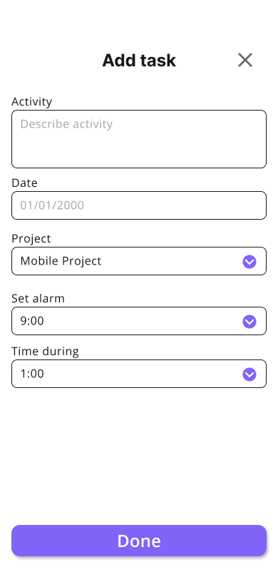
add task
After conducting usability tests, I made the decision to focus more on the "mini tasks" and opted to separate projects from tasks. Now, users first add the project and then add the tasks within that project. Users have the ability to select the category, priority, and color for each project, allowing for better organization and customization.


daily schedule
For the daily schedule, the priority now appears as a different-colored button, allowing users to easily identify and prioritize tasks. Users can also edit and delete tasks as needed. The colors are used to differentiate between different types of projects, and the project name is displayed for better organization.


weekly schedule
For the weekly schedule, I made the decision to remove the priority indicators for activities after receiving the feedbacks. Additionally, I included the name of the project that contains activities for each day, enhancing organization and providing better context for users. Furthermore, I divided the week into shifts, specifically morning, afternoon, and night, to further enhance the organization and clarity of the weekly schedule.


monthly schedule
For the monthly view, I simplified it as much as possible. I only indicated the presence of activities on each day, as users can already view the details in the weekly and daily views.


stats
The stats page now has a separate section, displaying users' goal achievements along with encouraging messages. It is divided into daily, weekly, and monthly graphs for better visualization.


the final design
hi-fi prototype
In the final high-fi prototype of the Tasker project, I created a user flow that encompasses several key screens. The journey begins with the onboarding page, where users are introduced to the app and guided through the setup process. They have the opportunity to set their waking and sleeping hours, ensuring a personalized experience.
Upon completing the onboarding, users are directed to the empty page, which serves as a starting point for organizing their tasks. From there, they can easily add projects and tasks, ensuring a systematic approach to task management.
To track progress, users have the option to mark tasks as done, providing a sense of accomplishment. Additionally, they can access the stats page, where they can review their performance and gain insights into their task completion.
Final flow
I was also required to create three additional screens for another device. In this case, I used the iPad Air as the device and designed the onboarding page, the daily schedule, and the add project page.
3 extra screens

key learnings & next steps
As key learnings, surveys played a crucial role in identifying and understanding the problems faced by users, offering valuable insights for improvement, while desirability testing validated and refined app features based on preferences.
Next, I plan to implement “should have” and “could have” priorities, introduce wellness notification popups to enhance engagement, and improve the weekly calendar design. Moving forward, I will refine the prototype flow, address usability issues through thorough testing, and ensure a seamless user experience.”